Link: The death of interactive infographics?

“Gregor Aisch, who works at the New York Times, gave a talk about the publication’s graphics and their impact. And the scary resumé of the talk was: Barely anyone interacts with the New York Times’ graphics. The New York Times makes arguably some of the best interactives in the field, which made Gregor’s talk even more depressing. His number of only 10–15% of people clicking on buttons — even essential ones — tells you that interactives are a waste of time and money.”

Fonte: The death of interactive infographics? – Startup Grind – Medium

Link: Prescriber Checkup – ProPublica

Prescriber Checkup

Há cerca de um ano, a ProPublica desenvolveu uma ferramenta para procurar e comparar as localidades e os médicos que mais receitam drogas nos Estados Unidos. Recentemente um dos editores lamentou o fato de muitos usarem a ferramenta para saber quem são os médicos que mais prescrevem opiáceos. O CJR fez um resumo do imbróglio.

Fonte: Prescriber Checkup

Link: Can we guess your age and income, based solely on the apps on your phone? – The Washington Post

Quiz: Can we guess your age and income, based solely on the apps on your phone?

Quiz baseado em pesquisa publicada no arXiv (PDF) tenta prever o perfil do usuário a partir dos aplicativos que ele tem no celular. Aparentemente, como mostra a imagem acima, uso apps de uma classe social acima da minha.

Fonte: Quiz: Can we guess your age and income, based solely on the apps on your phone? – The Washington Post

Link: Where the Middle Class Is Shrinking – The New York Times

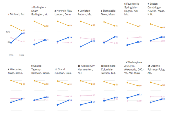
Pesquisa da Pew Research Center evidencia que a renda da classe média norte-americana caiu nas principais áreas metropolitanas do país. NYT mostra as principais regiões onde a classe média caiu e a classe alta aumentou; onde a classe média caiu e a classe baixa aumentou; onde a classe média caiu e as classes baixa e alta aumentaram.

Fonte: Where the Middle Class Is Shrinking – The New York Times